Overview
A widget is a generic term for the different types of “mini-applets” that can live on the dashboard. Currently there are eight widget types.
Widgets Descriptions Below
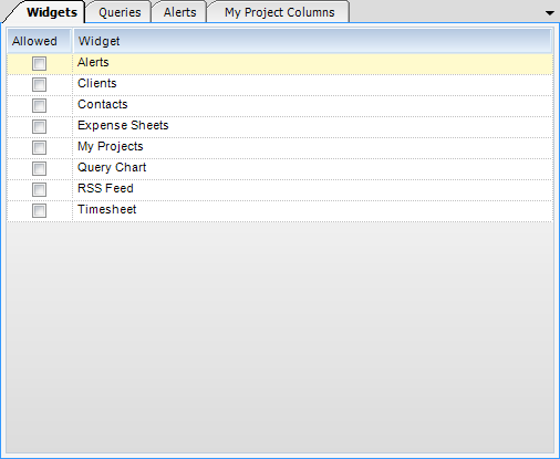
1) Alerts - The Alerts widget provides a list of predefined notifications.
2) Clients - Like the Contacts widget, the Clients widget allows a user to look up and add existing clients to a list for quick reference. Double clicking on the client name will bring up a Business Card View, while clicking on the Search button next to the client code will bring up the specific client record.
3) Contacts - The contacts widget allows a user to lookup and add an existing contact to a list for quick reference. Double clicking on first name will bring up a “business card” view, while clicking on the search button will bring up the specific contact record.
Note: If a user does not have permission to view the client’s applet, he will not see the Search button.
4) Expense Sheet - The Expense Sheet widget lists an employee’s expense sheets and color codes them based on current status. Double clicking a particular expense sheet will transfer the user to the Expense Sheet applet, with that expense sheet already loaded.
5) My Projects - The My Projects widget provides Project Managers, Project Accountants, and Principals a high level view of their respective projects. The widget provides a split view with a data grid containing project values and a column chart for easy viewing. Some of the columns can be drilled-down upon for further analysis.
6) Query Chart - The Query Chart widget provides a generic chart interface for predefined queries. Four different chart types are supported, including: Pie, Column, Bar, and Line Charts. Depending on the type of chart, the query must return columns in a particular manor.
| • | Pie - Shows the size of items that make up a data series proportional to the total of the items in the series. A pie chart always shows a single data series, and is useful for determining which item or items in the series is/are most significant. The first strong column in the resulting query will be used as the label. The first numeric column in the resulting query will be used for the slice value. |
| • | Column - Shows the changes in a data series over time or compares multiple items. Types of items are arranged horizontally, while data values are plotted vertically to emphasize variation over time. Each row is drawn separately as a group of vertical columns. These groups are called a series. The first string column is used as the series label. Every numeric column will be displayed in the chart. |
| • | Bar Graph- Shows the changes in a data series over time or compares multiple items. Types of items are arranged vertically, while data values are plotted horizontally to emphasize variation over time. Each row is drawn separately as a group of vertical columns. These groups are called a series. The first string column is used as the series label. Every numeric column is displayed in the chart. |
| • | Line - Emphasizes the amount of change over a period of time or compares multiple items. Data |
points are plotted in series, using evenly-spaced intervals and connected with a line to emphasize the relationships between the points. Each row is drawn as a single line (or area) on the chart, with a number of points in the line equal to the count of numeric columns in the data set. Every numeric column is displayed in the chart. The first numeric column encountered in the data is used for the value of the first point, the second column for the second point, and so on.
7) RSS Feed - The RSS Feed widget is used to consume RSS 2.0 or Atom 1.0 feeds. The feeds can be any valid RSS URL. Double clicking one of the items in the feed will navigate the default web browser to the particular article.
8) Timesheet - The timesheet widget offers a summarized view of an employee’s most current timesheet with the ability to “jump” to that timesheet for completion or submission.