Overview
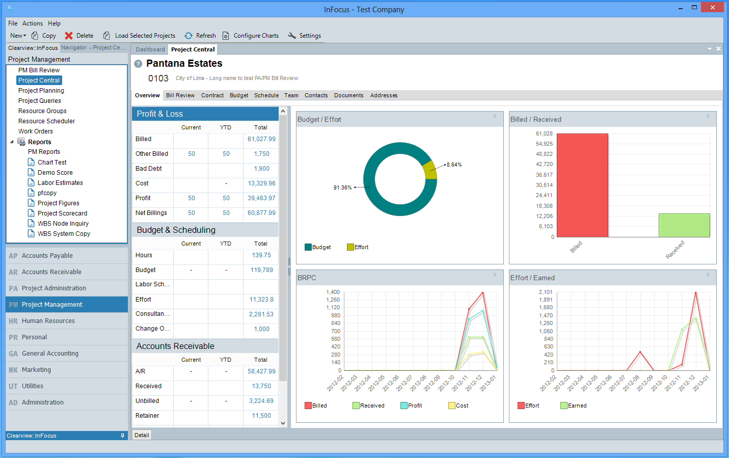
The InFocus User Interface (UI) is designed to be a user-friendly work environment that allows the user to navigate from one screen (applet) to another. Below are the major features of the UI.
Toolbar
The InFocus Toolbar is dynamically built in accordance with the active applet on the screen. That being said, the following menu options are always available.
File
Though the File menu contains applet specific options such as Save, Close, Delete, etc, by default the following options are listed:
| • | Dashboard - Returns the user to the Dashboard applet |
| • | Logout - Logs out the current user and closes the application |
| • | Exits - Closes the applicaiton |
Help
The following static options are available from the Help menu:
| • | Change Password - Changes the current user's password |
| • | About - Displays current InFocus application information |
| • | Manual - Launches InFocus User Manual. |
| • | Support |
| o | Client Login - Launches Clearview Support |
| o | Remote Desktop - Lauches Clearview Remote Desktop |
General Navigation
InFocus utilizes a Module>Applet approach where the Module represents the area of core functionality and the Applet the on-screen activities. InFocus navigates from left to right: When selecting a Module>Applet, InFocus displays the interactive contents (Tabs, Buttons, Grids, etc) of the selected applet. For example, the following depicts a user working in the Project Management module, Project Central applet. For purposes of this manual, InFocus locations are referenced as follows: Project Management>Project Central.
